
Difficulty: Beginner. I try to provide detailed explanations for anyone who needs them. The detailed instructions are set off a little from the main actions in each step, so if you don't need them, just skim down.
Translatable: Should Work For Any Program With Layer Support and Basic Brush Variance Capabilities.
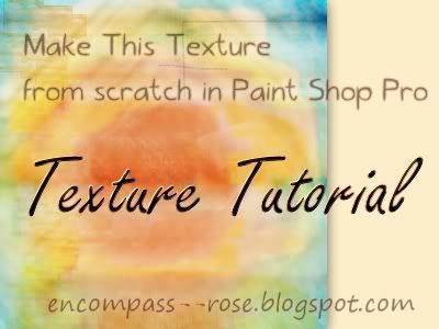
My last "texture from scratch" tutorial is still getting a lot of hits, so I wanted to make another one. I am using PSP X5, but I tried to only use materials that come standard with PSP 8 so most people should have no problem following along. The techniques will work with any custom materials and brushes you have as well. I chose to use the standard program tools because they are available to anyone using Paint Shop Pro.
This uses the brush variance palette to create texture effects from the standard PSP brushes. I don't provide my exact brush variance settingsbecause I don't remember them because I think it's more fun to experiment than to copy someone's precise settings.
Notices: This texture is free for any use, but you may not re-upload or redistribute it as is.
Written content is (c) Rose B. Fischer/Encompass Rose Design and may not be republished without written permission.
This uses the brush variance palette to create texture effects from the standard PSP brushes. I don't provide my exact brush variance settings
Notices: This texture is free for any use, but you may not re-upload or redistribute it as is.
Written content is (c) Rose B. Fischer/Encompass Rose Design and may not be republished without written permission.
1. Press F11 on your keyboard or go to View>Palettes>Brush Variance.
If you're not familiar with the Brush Variance Palette and How It Works.
The brush variance palette is a small box that lets you control various properties of your brushes to add effects like jitter, alternating rotation, alternating size, and fade-in/fade out. It works with any brush tip, though some will give you better results than others. You can set the brushes so that the fade rate, rotation angle, size, and position will change slightly as you apply it. This is useful for creating textures because it allows you to create effects and brush strokes that are not uniform or do things like create "virtual confetti", bubbles, or even do complex designs by making the rotation of the brush change as you move it.
It can take some experimenting to achieve the effect you want, so don't be intimidated by all the variables. Open a new canvas and put some experimental brush strokes each on a new layer. That way you can quickly and easily delete the layers if you're not getting what you want. Then when you have some you like, you can save them as a preset by going to. Try altering the "step" size in your main brush palette as well. Usually, the bigger the step size, the more space you will get between brush strokes as you make a continuous motion.
For PSP 8 users, the program comes with a lot of useful brush presets that don't seem to come standard in PSP X5. Try playing around with "instant satin" or
You don't need to use the same presets from your practicing when you do the tutorial; you can make others as you go along if you find that they're not working. A little experimentation beforehand is just a good way to get comfortable with the functions we're using.
If you're comfortable with the brush variance palette, you can just leave it open because we'll be using it later on.
2. File>New. My document is 2500x2500 px @ 72 ppi, with a transparent background.
The size is something I just chose because it's small enough to be workable for a tutorial but large enough for the texture to be useful in many different projects.
The resolution (72 pixels per inch) is standard for most monitors and I assumed that most of the readers here are looking to design web graphics.
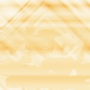
3. Add a color fill layer. (ex 1)
- Press F6 or go to View>Palettes>Materials Palette if it isn't loaded already.
- When you hover your mouse over the colors there, it will change to an eye dropper. Click on the foreground color (the big square in the top corner) and it will open the Material Properties dialogue. This is where you choose your colors.
- Choose a light color. Mine is #fcebbf
- Layers>New Raster Layer
- Use your paint bucket tool (on the left side of your workspace) to flood fill the canvas with the color you chose.
I chose my color because it was muted and easy on the eyes. It would be a good base color because I could add other colors or effects to it later without it overpowering them. It also reminded me a little bit of old paper, and even though I didn't want a paper texture, I like the look and feel of old paper.
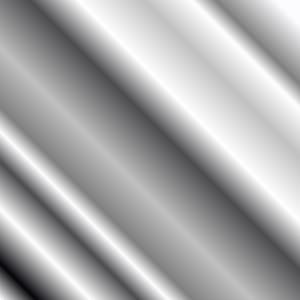
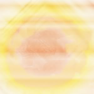
4a. Choose a gradient. (ex 2)
- You choose a gradient in the materials palette. Access the properties box the same way you did in the last step. The second tab there says "Gradients."
- Pick one you like.
- Layers>New Raster Layer
I used the metallic silver gradient that comes standard with PSP. The reason I grabbed this one was because I wanted to use tools that everyone has available. I also know that gray, black, and silver tend to disappear when set to certain blend modes, but the details on the layer (like the lines in the gradient) will remain visible. Try different things though. You may find an effect you like better.
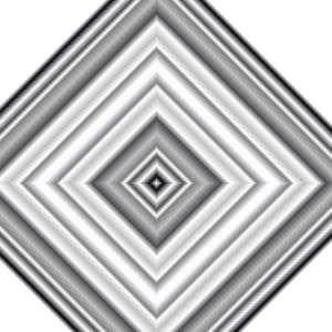
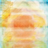
4b. Change the blend mode and/or opacity of your gradient layer. (ex 3.)
Blend Modes are settings that affect the way each layer interacts with the others. The default blend mode is "Normal." Normal means that the layers are just sitting one on top of the other like a pile of fabric swatches. The other blend modes cause the pixels from the top layer to interact with the ones underneath them.
- Press F8 or go to View>Palettes>Layers if your materials palette isn't up already.
- The Layers Palette is a list of all the layers in your document and what properties have been applied to them. I have mine in a custom location, but I think the default is for it to appear under your materials palette.
- The main area of the palette has thumbnails of each layer, the name of the layer (probably "raster 1," "raster 2" etc) and an eyeball icon next to each thumbnail.
- Look for the word "Normal." The location of the blend mode options is different depending on which version of PSP you are using. PSP 8 has it to the right of each layer's name. PSP X5 has it at the top of the palette.
- When you find the word "Normal," click on the triangle next to it and try different options until you find something you like.
- You can also change the opacity of the layer by going to where you see the number 100 and moving the slider (or just inputting a different number.)
I just used soft light at 100%. It was the first thing I tried. I experimented with some other settings and ended up going back to it.
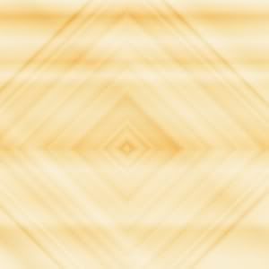
5. Darken the texture base. (ex 4)
I wanted the base to be darker and a little more defined, but I didn't want to merge my layers yet in case I changed my mind later. So I copy-merged and pasted the copy as a new layer:
6. Continue adding gradient layers and changing the layer properties until you have something you like.
I used the same gradient twice more, but I altered the gradient properties so that each layer was different.
5. Darken the texture base. (ex 4)
I wanted the base to be darker and a little more defined, but I didn't want to merge my layers yet in case I changed my mind later. So I copy-merged and pasted the copy as a new layer:
- Edit>Copy Special>Copy Merged. in PSP X5. In PSP 8 it's just Edit>Copy Merged.
- Edit>Paste>Paste As New Layer
- Set the new layer to multiply.
6. Continue adding gradient layers and changing the layer properties until you have something you like.
I used the same gradient twice more, but I altered the gradient properties so that each layer was different.
- I set this layer to soft light at 55% to get this.
- Then I set this layer to soft light at 48% to get this.
Go ahead and experiment with your own gradients, gradient properties and layer settings.
You can access everything from the gradients tab in the materials palette. The small black and white buttons under the main gradient will change the style. Angles and number of repeats have their own checkboxes clearly labeled.
You can access everything from the gradients tab in the materials palette. The small black and white buttons under the main gradient will change the style. Angles and number of repeats have their own checkboxes clearly labeled.
7. Eliminate parts of your gradient layers.
Since this texture isn't complicated, I'm using the eraser brush. There is another method that involves mask layers--layer masks in PS-- but that would be another tutorial by itself.
The eraser tool is located on the left side of your screen, just above the paint bucket. When you click it the default eraser is a square brush tip, but you can change it by going to the top of your screen where you see a thumbnail of the brushes and clicking on the triangle there. You'll get a drop down list of all the brushes you have installed on your computer.
Erase any part of the gradient you don't want. Change up your brush tips a few times and set different variances each time you change (or you can use the same brush tip with different variances set)
Tips:
- The brush variance palette works the same way for the eraser brush as it does for the paintbrushes. Some options will be grayed out, but it's okay because they're not related to anything we might use to give the base some texture.
- You can right-click to un-erase sometimes too. A trick I use if I decide I took off too much is to go back in and do some light stamping with my right mouse button.
- Mask Layers are another possibility instead of erasing directly on the layer you're working on. This is effective because you can move the mask around and try out different positioning or do different overlays. I use mask layers when I'm doing a complex texture or a photomanip, but for this technique, I find it easier to use right-click to un-erase since I won't need to change much later.
I just tried different brushes and clicked undo if I didn't like what I got after a few strokes. I mainly used the "wavy" brush, a "marble," brush and one of the "wispy" or "smoke" brushes at this stage. To demonstrate the effect, this is what the result would look like if the gradient layers were set to 100% opacity. I didn't want that much definition because I figured that I would be copy-merging or adding adjustment layers later, so I kept the gradient layers at the opacity I had them in step 6.
8. Add some color.
I used gradient layers for this and erased parts in the same way that I did for the last step. You can also try pattern layers, or just painting on the canvas with your brushes.
- Color layer 1. Landscape gradient with the texture box in the corner of the materials palette checked. The texture I used is "fine grain." Set to soft light and erased until I was happy. (result)
- Color layer 2 and repeat the above steps. (Sorry, I don't have an example for this one, but you get the idea.)
9. Add more brushes or a pattern layer. (Ex 9)
Put each brush or pattern on it's own layer. Once again, just try different things until you find something you like. I stuck with basic brushes, the rectangles and circles. I varied the thickness, hardness, and size of the brushes, and applied different variance settings every so often. Mainly I used the repeating fade in/fade out and a slight jitter. I tried to make my settings small so that the effects were not overpowering. If you use a pattern layer, you can erase parts of the pattern the same way as the gradients in earlier steps.
Put each brush or pattern on it's own layer. Once again, just try different things until you find something you like. I stuck with basic brushes, the rectangles and circles. I varied the thickness, hardness, and size of the brushes, and applied different variance settings every so often. Mainly I used the repeating fade in/fade out and a slight jitter. I tried to make my settings small so that the effects were not overpowering. If you use a pattern layer, you can erase parts of the pattern the same way as the gradients in earlier steps.
10a. Turn some of your layers off.
Remember that eyeball icon from step 4? If you click it, it will become grayed out, and your layer will no longer be visible. Experiment with turning different layers on and off until you have something different from your original texture but still complimentary.
10b. Copy-merged and paste as a new layer.
See step 5.
10c. Change the blend mode of the new layer and move it slightly. (Ex 10)
Move the layer by clicking and dragging with your mouse. Move the layer over slightly and erase any hard edges or other parts that you don't want.
I used "multiply" because my canvas was really light, but you can also try screen or lighten if you find yours too dark. "Overlay" and "Soft light" will give interesting effects sometimes too. Remember to turn the rest of your layers back on.
If you're not satisfied, you can turn different layers and repeat step 10 again. I did it twice and erased different areas with different settings applied to my brushes.
And that's all. Here's my final result:
I hope you enjoyed this tutorial and feel free to show me any results you make with it.
I hope you enjoyed this tutorial and feel free to show me any results you make with it.
I have been to your pages time and time again. At first I thought there were no tutorials because no words or pictures are showing. I got frustrated... But, today, I just decided to click and drag in a section of the page near a couple links. And you know what I found out? I found out that these pages do have tutorials... but it's white text on a white background. It would be nice if you fixed this.
ReplyDelete